
Acronyms, emojis and icons seem to be replacing written information at every turn. Can this trend really sustain? Communication is evolving and the art of communication has never been more important to the articulation of your brand.
Consider the history of written communication. Letterforms evolved from simple images and petroglyphs coinciding with the development of spoken language. These scribed parts of human communication have become singular works of art in the form of type. Since the invention of the Gutenberg press, type is used everywhere and there is a myriad (little font humor for you) of typefaces available at the click of a mouse.
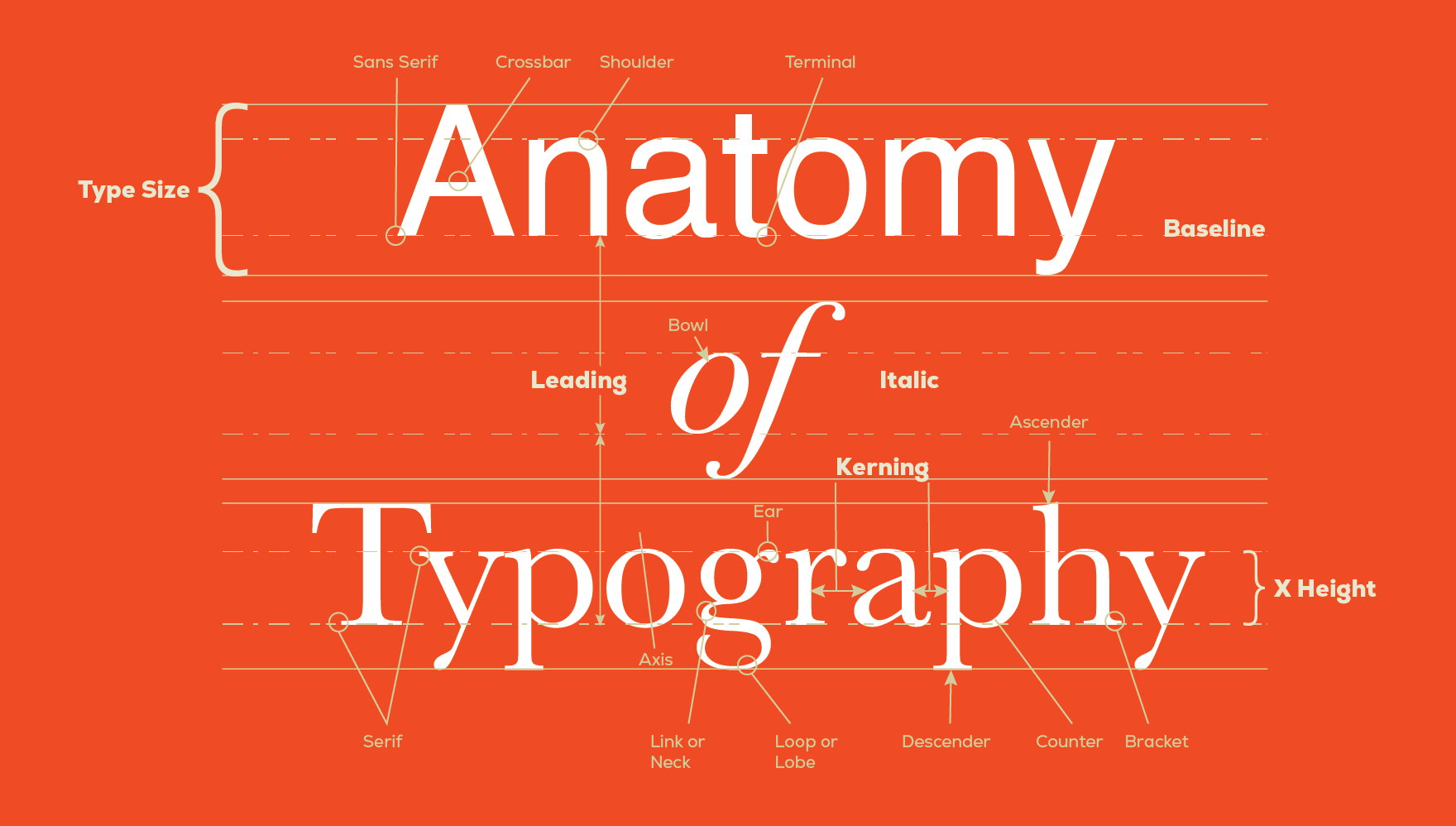
The written word is powerful and how we dress the written word is, in short, type design. When we execute design using type effectively, we inform and delight the viewer. We make the informational experience easy and impactful. Before we go shopping for a new message wardrobe, a quick look at the anatomy of letterforms may uncover a hidden desire for thick terminals or hanging descenders that you never knew you had.
PROJECT SCOPE
Where will the message be seen? Is it advertising, packaging, web, UX/UI? In the past, there used to be some restrictions on typefaces used for various platforms but since the advent of variable and open type, most typefaces are very adaptable and transferable across platforms. However, one still needs to be aware of being visually consistent through all touchpoints of a project’s scope.
MOOD
Basically, this is the tone of your brand message. How you want the viewer to feel after looking at your information. Is it fun or serious? Is it playful or sincere? Are you modern or classic? Typefaces are the clothes that your words wear. They not only enhance the image of your brand message, but they also enforce the consistency of your brand standards.
VERSATILITY
Not only does a font choice have to fit the scope and mood of a specific project, but how does it relate to other projects for consistency? Is the font part of a typeface that has many different weights or widths? A versatile typeface will consistently enforce your brand image and message.
READABILITY
How readable is a particular typeface at varying sizes, weights and widths? Does it help the reader to navigate information smoothly? This is the functional aspect of typography. There is a beauty in function. Some fonts flow better than others.
STYLE
There are four basic font styles: serif, sans-serif, display and script. Most contemporary typefaces are either serif, or sans-serif. A clean modern look is often associated with sans-serif fonts. With more information being read on screens, sans-serif fonts have become widely used, as serifs tend to get lost at smaller sizes and lower resolutions. However, with screen resolutions improving rapidly, serif fonts have found their way back into the fold and can provide a clean “classic” look that is sometimes easier to read as the serifs are seen to connect letters together creating an easier visual flow.
HIERARCHY
The difference between relaying information and categorically organizing information to be systematically digested is called typographical hierarchy. Proper hierarchy provides a clear path of importance for the reader to follow. A key design principle is contrast. Designers use contrasting WEIGHT, SIZE, CASE and COLOR to separate key points from supporting information in typographical hierarchy.
Here are some examples of how designers use these various techniques to create hierarchy.
Design by: Yi Jun Lin
Having fun with this article
Design by: Mandy Rochat
Hierarchy doesn’t have to be linear. In fact, these examples break up the traditional grid while maintaining a path of importance that is functionally engaging.
Choosing the right type design for your brand takes artistry as well as science. At Bachman Brand Development, we are the outfitters of your message. Our job is to find real solutions to the effective articulation of your brand. Get in touch with us. We’d love to contribute to the success of your next project.
Source information:

