Keeping tabs on trends in design is vital for any creative agency. Further, embracing current Graphic Design trends can make a brand more relevant in the here and now. By implementing design trends, a brand can show its audience authenticity with strong emphasis placed on design. In fact, refreshes to existing brand pieces like packaging, literature and video are one of the main reasons that clients come to us. When current branding merges with relevant design trends, results can be striking. Here are some design trends that are making an impact now and for the foreseeable future:
Bold Minimalism:
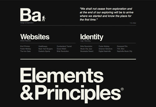
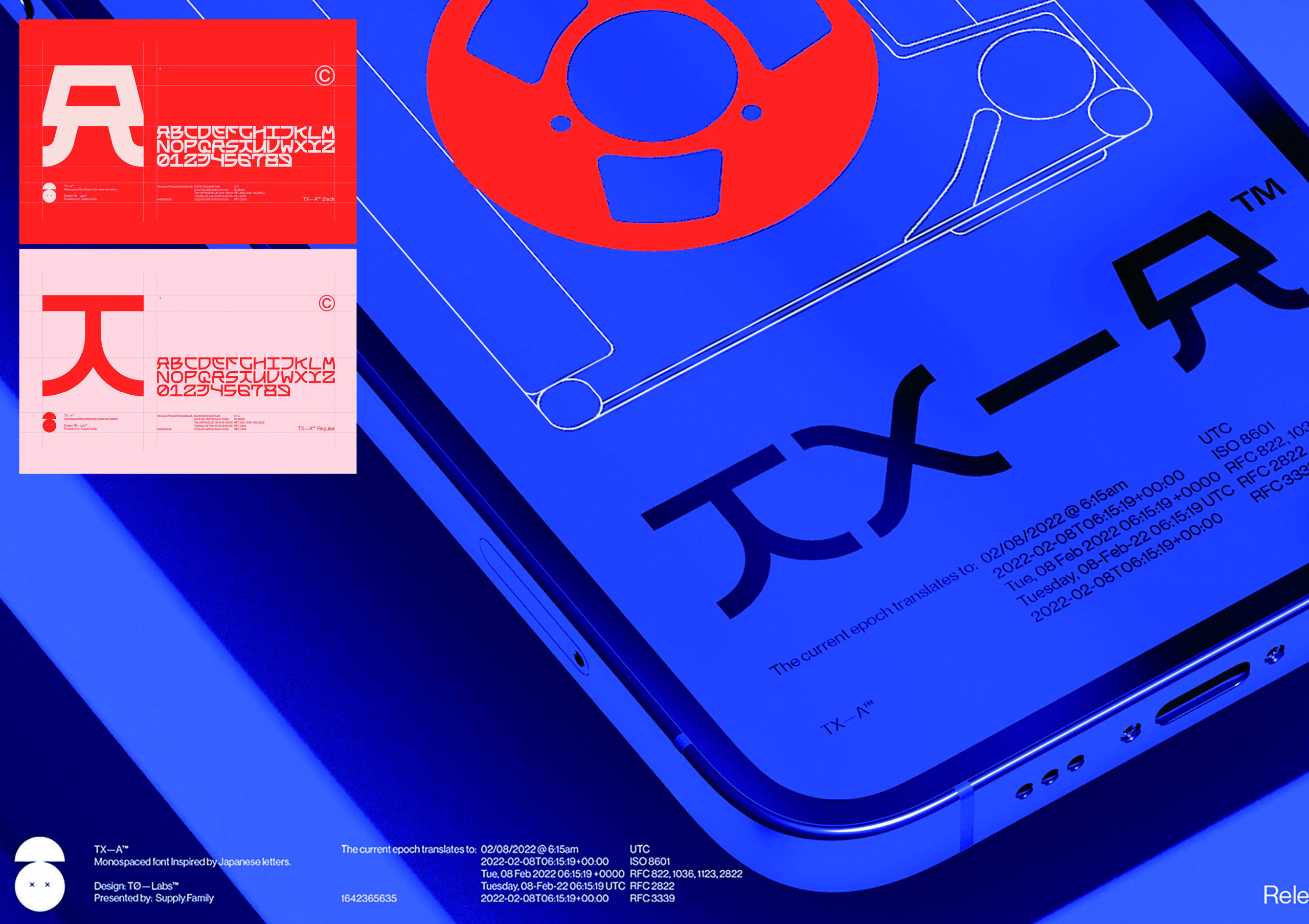
Simplicity is at the core of what makes great design work and Bold Minimalism takes its “less is more” approach from early 20th century Bauhaus Design. Rooted in the philosophy that “form follows function” and void of “unnecessary” ornamentation, the beauty is the message itself. Use of clean typography and white space therefore, were the traditional methods of Bauhaus minimalism. Today’s enhancement is bold with bright color and simple layout structure. This process however, takes considerable discipline to put aside the designer’s natural inclination to add rather than subtract. Pairing down a design to its cleanest form can be quite stunning and differentiating.
Work: Sexto Nplugged Music Festival designed by Lorenzo T MB | Blake Allen Design Promotional Piece | Realtor.com homepage design by Huge Inc. | iodigital web design
Abstract Gradients & Patterns:
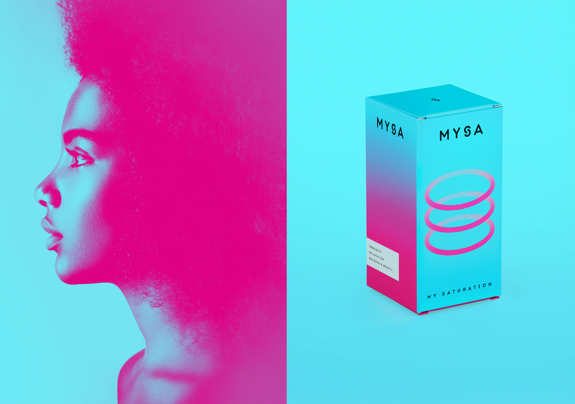
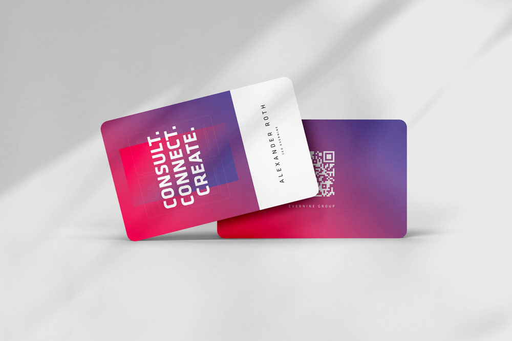
Gradients have made appearances in design trends before, but often fall out of favor as they can be difficult to print. Gradients blend a mix of colors in a soft transition creating stunning variable effects. The resurgence behind this trend is seen adding depth to flat spaces with shifting light and dark colors. Several brands have infused this trend into their designs by keeping it simple and clean. The rub has always been that gradients can get muddy if they become overly complex, so designers are infusing simplicity when used today.
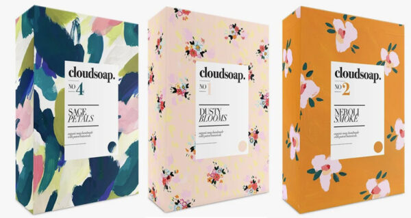
In addition to gradient usage, patterns are making a comeback as well. Whereas adding ornate elements seems a direct contrast to minimalism, a contrast is needed to combat the “blanding” effect where simplification of logos has left many classics seeming generic. Creating a unique pattern conversely, adds another visual addition to brand messaging over multiple platforms. Like working with gradients, patterns can get messy because of their visual complexity, but treating these elements with a bit of simplicity and cleanliness creates balanced texture.
Work: MYSA Personalised Vitamins Kits Packaging Design by Veronika Levitskaya | Museum of Gen Z branding by Aoran MA | Brand Design by Evernine Group | Packaging design for Casteller Chocolateria by gotza | Cloud soap package design by Jamie P. Smail
Utilitarian Design:
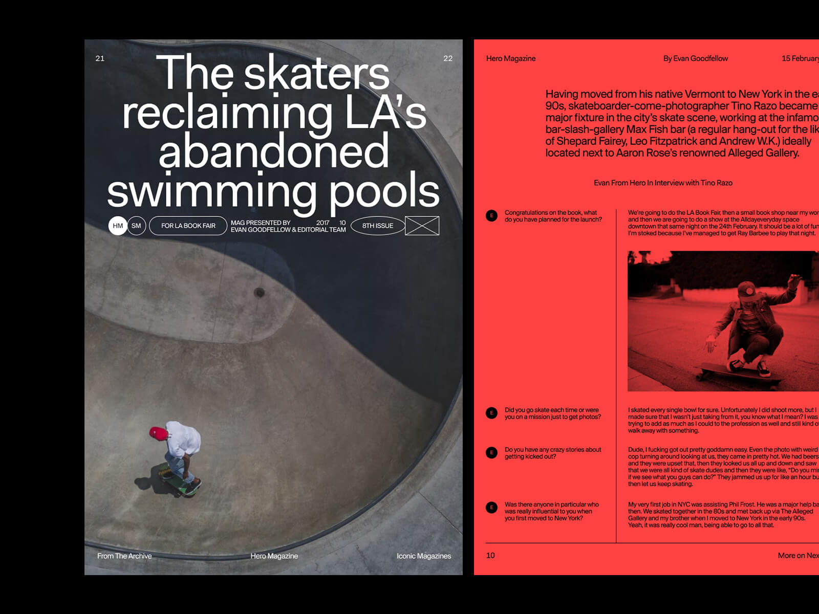
Design that emphasizes utility over other values is useful across a wide range of media. Utilitarian design, rooted in all things “utility” such as: Maps, mechanical brochures, instruction manuals and menus. While it exhibits some of the same principles of Bold Minimalism however, the departure is seen through the introduction of diagram elements or iconography to enhance functional clarity therefore, providing an easy relay of information. It’s important to note that these additions are generally bold and simple creating instant recognition. UX/UI design has embraced Utilitarian Design the past few years, as hierarchical pathways and simple instruction are needed to create adaptable experiences with apps and websites.
Work: Victionary fall catalogue 2023 by Victionary | Wireframe Shapes,Graphics by Era Woolbright | Skate Magazine Layout by Marko Cvijetic | Poster design by André Forrester (Meister)
Doodles:
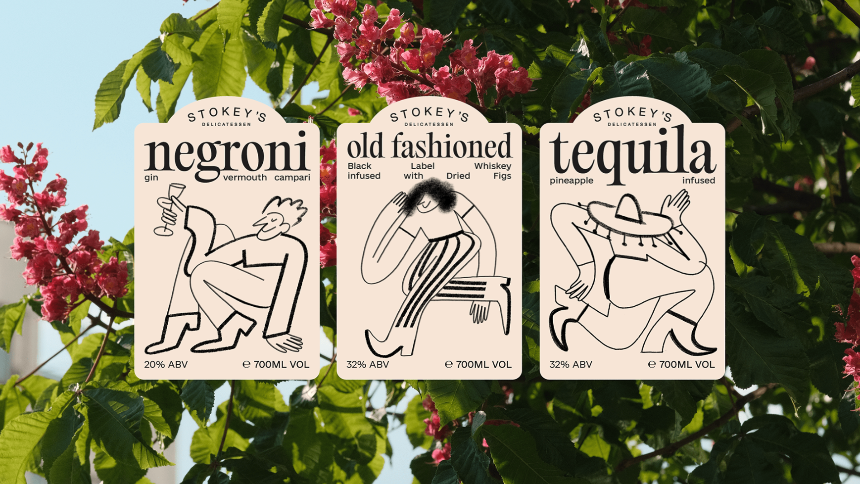
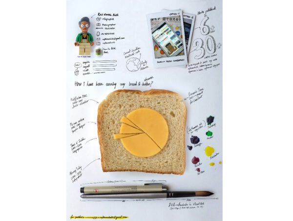
To add a little fun to your branding, try the addition of hand drawn elements to a touch of whimsy and authenticity. Expanding on the idea of doodles in the margins of a notebook, these elements are created spontaneously indeed, bearing unique character and imagination. What could appear more “human” than that? Any hand-done design indeed, infuses emotional attachment into any design. If we think about where graphic design is headed after all, toward a path of digital precision and A.I. generated “ideas”, a natural element such as a doodle creates a stronger audience connection.
Work: Cocktail Package design by Katalina-Maievska | Self Promo Infographics by Raj Kamal | Branding for Colonia Atelier by Pao Bassol | Nike Project by Perfect Bliss
Nostalgia:
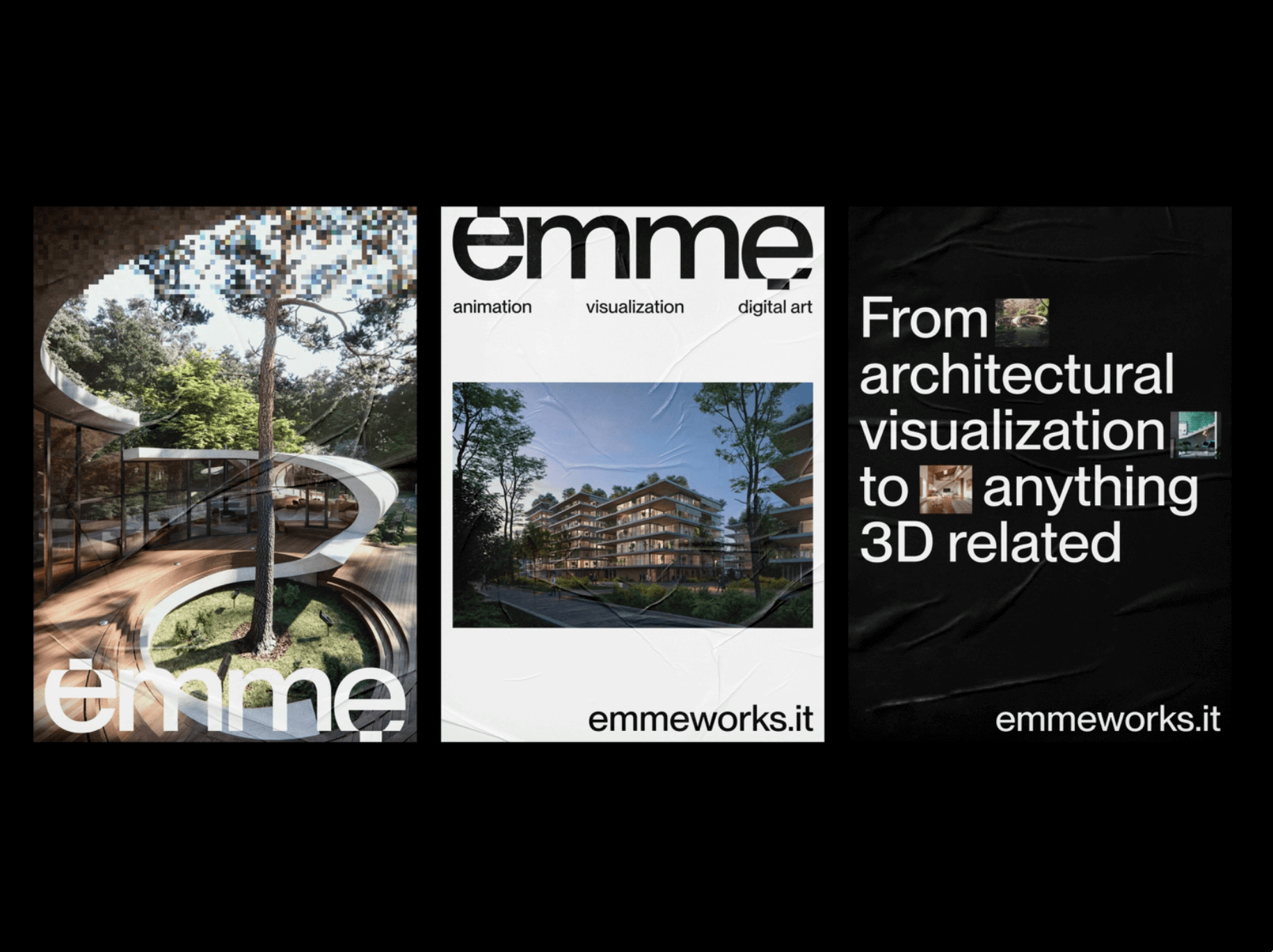
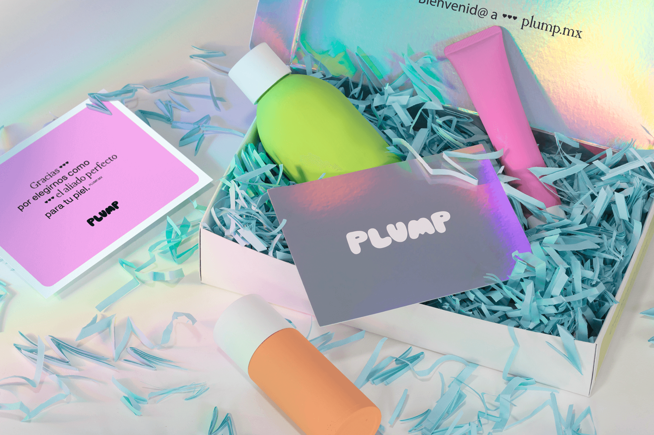
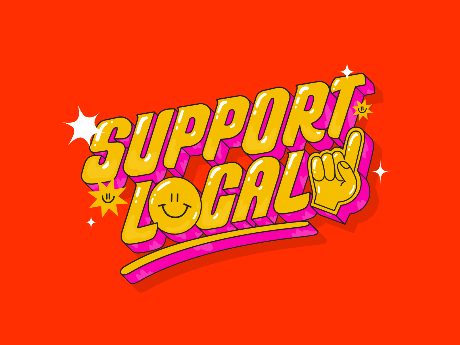
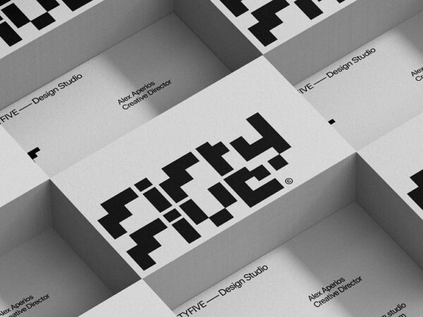
Every now and then designers like to wax nostalgic, resurrecting or reinventing a part of the past to give it new life. Pixels and Bubble Type are some nostalgic elements and a focus of these re-discoveries. However, nostalgic color combinations and grainy photos also serve to solidify the look. Trends in design are very cyclical as creatives search for inspiration through the ages, carrying over bits and pieces of these historic artifacts in order to enhance a brand’s originality. This trend identifies the charm in those jagged edges and curvy “Rubenesque” letterforms. Nostalgia can evoke a simpler time and who doesn’t enjoy a little throwback. With more emphasis being placed on clean, minimal aesthetic today, a nostalgic look back can be a needed disruption if only for a short time.
Work: Emme Posters by Antonio Calvino | Plump brand design by The Branding People | Support Local designed by Ale Hernández | Fifty Five Design Studio branding by Alex Aperiios
It’s the nature of trends to come and go therefore, they can be an energetic injection in the moment yet still a risk . In the hands of skilled creatives, proper use of trendy elements can transcend the trend and add relevance to a brand nevertheless, to capture timeless design is to create work that is impervious to trends and weathers the cyclical changes in design taste. Examples of timeless design can be seen in brands like Apple®, Nike® and Starbucks®. These are brands that have minimally changed their look through the years and have either set trends or smartly adopted trend elements to continue their relevance.
“In order to remain timeless, brands need to be open to change while staying true to who they are and what makes them unique.”
– Matt Sia, Creative Director at Pearlfisher
At Bachman we continually monitor trends to bridge timelessness and relevance in the work we produce. If your brand is struggling or getting lost in the sea of competition, put our creative experience and talent to work for you. Let’s get together.
The visual cues in this article were not produced by BBD, they serve to only illustrate design trend examples. Not only are we designers, but educators and design enthusiasts who take inspiration from the world around us.
Links to Sources:
Graphic Trends 24 Published in Codeart
Trends v Originality Trends vs originality; An ever-growing paradox – by Motivate’s Hebah Ikhleif
Timeless vs. Trendy Timeless vs. Trendy — Enduring identities and what brands can learn from the Bauhaus by Kyle Ranudo
Graphic Design Trends 2024 Sibgha graphics


