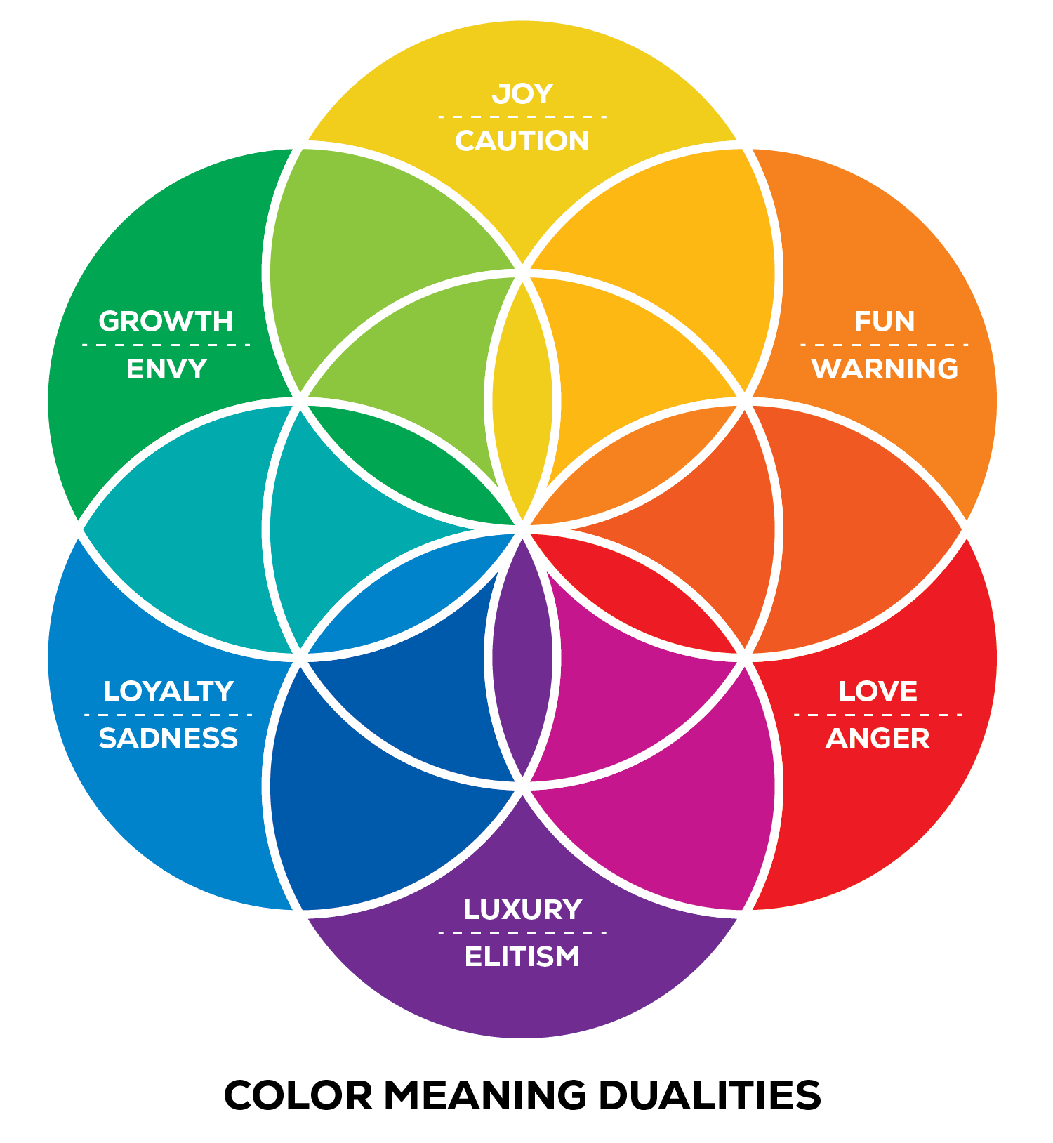
Selecting a color palette is one of the most important and fun aspects of brand and packaging design. However, designers must be attentive to universal meanings and associations with color before applying it to designs. The importance of color selection also varies depending on the application. For instance, an advertisement for a one-time event has a lot of leeway, since it’s a temporary and stand-alone piece of design. On the other hand, a brand’s identity and logo should make careful use of color, as this application is long-lasting and represents the brand’s values. Consistency in a brand’s color expression is the key to success.
Generally speaking, color may also be interpreted differently depending on context. Take yellow, for example, which is considered a color of optimism and energy, like the rising sun or a bright summer day. However, because of its use in traffic and warning signage, it may also be associated with caution or danger. In interior design, many advise against painting a nursery yellow, as the intensity may cause babies to cry more often, while a yellow kitchen may inspire productivity when cooking. Yellow is often used in fast food logos because of its eye-catching nature and how it triggers an appetite response. When it comes to packaging, a pop of yellow is often used for violators that call attention to an important piece of information about the product, helping it to stand out against all the other packaging at shelf.

Color associations often vary in different cultures as well, and it’s important to be aware so the intended message is not miscommunicated. For example, in Chinese culture, yellow is considered a color of royalty, while Americans would likelier associate purple with royalty. Americans also tend to view white as a color of purity and associate it with marriage celebrations, while Chinese culture often associates white with mourning and even death. These are just a few examples of how designers must be culturally sensitive to color depending on the region in which the design will be seen. In addition to context and application, designers must consider the regions in which the design will be seen to most effectively communicate the intended message.

